Colour
Colour plays an important role in visually expressing the McConnell Dowell brand. Our colours take advantage of our long and positive association with green.
Consistent use of the colour green is vital in building a strong and easily recognisable McConnell Dowell brand.
Primary
The McConnell Dowell brand is predominantly green. Use our green colour whenever and wherever possible. Think of the colour green as an extension of our logo.
Our other primary colours are white and black.
|
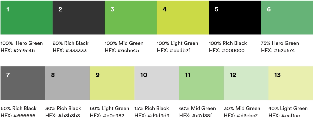
Hero Green RGB: 46/158/70 |
White RGB: 255/255/255 |
Rich Black RGB: 0/0/0 |


Secondary
Mid and light green are support colours used in our dynamic beam graphics. Secondary colours may also be used for graphs, infographics and data visualisation. Don’t use mid and light green in large blocks or as background colours.
|
Mid Green RGB: 108/190/69 |
Light Green RGB: 203/219/47 |
Rich Black RGB: 0/0/0 |


Usage
Hero Green
To maintain strong recognition of our brand it is crucial to keep communications predominantly green:
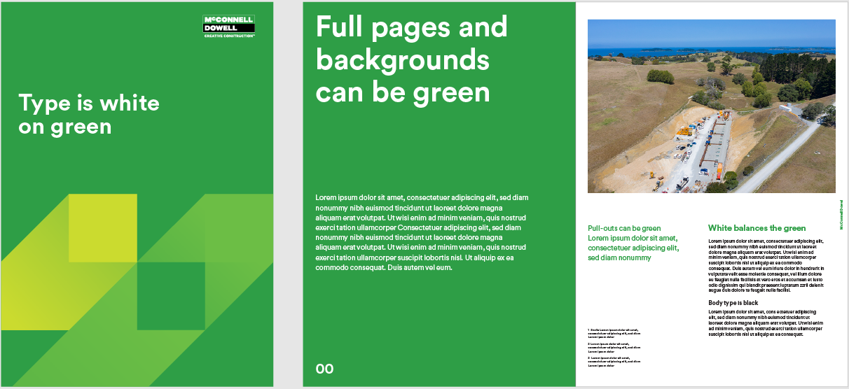
McConnell Dowell is green.
It is our signature colour.
Think of green as an extension of our logo.
Use it in large blocks where possible.
White
White plays an important role in providing balance for the green. Offsetting our green colour as a page background and for typography.
Black
Black is used for setting for typography on light backgrounds. Don’t use black in large blocks or as a background colour.
Light shades of grey may occasionally be used for backgrounds if required.
Mid & Light Green
Mid and light green are support colours used in our dynamic beam graphics. They may also be used for graphs, infographics and data visualisation. Don’t use mid and light green in large blocks or as background colours.
Tertiary (or accent colours)
To create better contrast and highlight our green, the below set of colours can be used as an accent colour in McConnell Dowell brand collateral and assets. Primarily in maps or infographics where a contrast between visuals is vital for clear understanding.
Please note, these colours should not become the primary colour or focus in any McConnell Dowell artwork.

Neutral Blue RGB: 46/106/158 |

Contrast Blue RGB: 0/44/62 |
Complementary Purple RGB: 107/45/92 |
Warning Red RGB: 229/70/36 |
Warning Yellow RGB: 243/160/0 |


Infographics
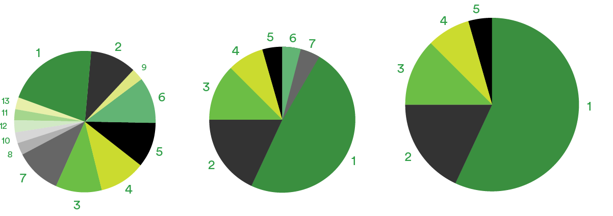
Tints from of our brand colours and the Tertiary colour palettes can be used for colouring information graphics and data visualisation.
The examples here demonstrate: the permitted brand colours and tints, the sequence of colours and the relative importance of colours in sequence.
Colour sequence
Examples
Reproduction
It’s important that our brand colours are reproduced accurately. Colours change dramatically between screen and print. This is particularly noticeable in our mid and light greens.
Always use the specified PMS, CMYK and RGB values specified for each colour.
Each value has been specifically calibrated for that particular display environment. These values enable accurate reproduction of all colours in print and digital scenarios.
Clothing and signage
Clothing and signage applications may not use these values for production however do we want to match the shades of our brand colours as close as possible.
|
RGB Makes colours for screen from Red Green and Blue. |
Pantone PMS Matches the exact colour specified from one single printing ink. Also used to reference paint colours and vinyl for signs. |
CMYK Makes colours for print from a mix of Cyan Magenta Yellow and Black inks. |


When to use which value
RGB
Use RGB values when displaying colours on screen for websites, PowerPoint and other on screen or digital environments.
CMYK
Use CMYK values for four colour process, offset, short-run, digital or laser printing.
PMS
Use PMS (spot) values for offset printing or signage.