Typography
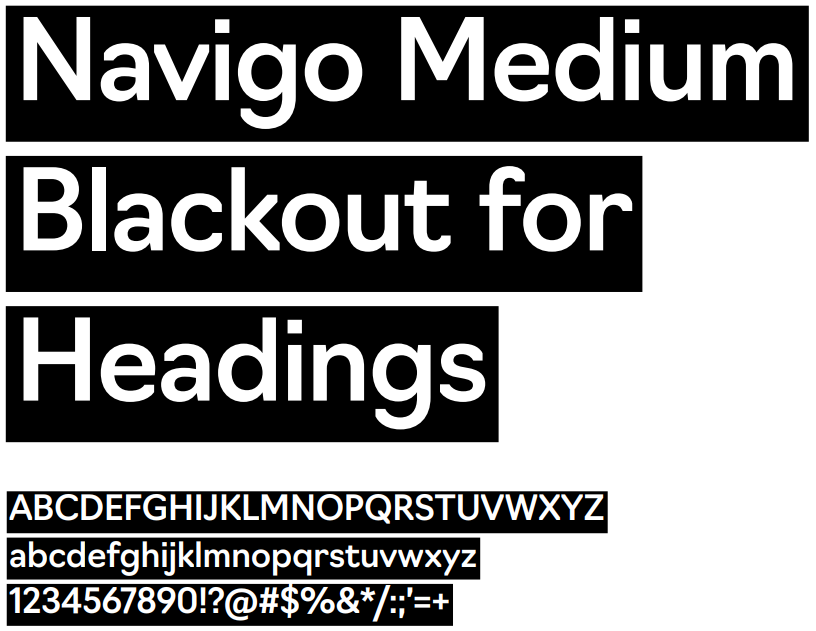
Headline & Breakout TypefaceNavigo Medium is the Built Environs headline typeface and is an important part of the visual language of the brand. Used in large size with a ‘blackout’ background, it is to be used as a headline/title style as well as for breakout text within documents. Navigo Medium has been chosen for its contemporary proportions and distinctive style. Navigo Medium is available via Adobe Fonts and can be activated as part of the Adobe Creative Cloud suite. |
 |
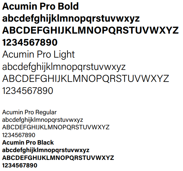
Body Copy TypefaceAcumin Pro is the Built Environs body copy typeface. Use Acumin Pro for information such as body copy and smaller detailed typography. We use four weights of Acumin Pro:
Acumin Pro is an Adobe Original typeface that has been chosen for its balanced, rational qualities and its exceptional performance and text size. Acumin Pro is available via Adobe Fonts and can be activated as part of the Adobe Creative Cloud suite. |
 |
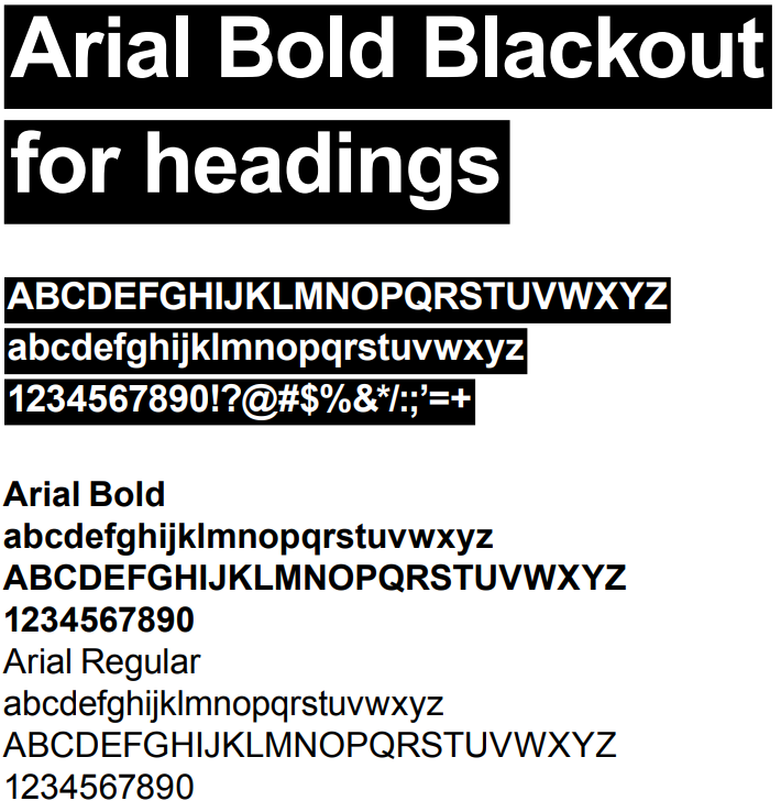
System TypefaceArial is the Built Environs system typeface. For internal use when Navigo and Acumin are not available use Arial. Use Arial in office applications such as PowerPoint and Word for internal documents, letters, emails, memos, presentations etc. Do not change the height of the blackout background in headings The blackout background type style for headings is set to accommodate the total height of a block of text including ascenders (top of capital letters and vertical strokes in tall letters) and descenders (parts of letters that drop down such as in the lowercase g). In instances where there are no descenders in a heading there will be more space below the type than there is above. |
 |
Blackout HeadingsThe proportions of our type styles have been carefully chosen to build and maintain a consistent and recognisable brand across all of our communications. Do not change the height of the blackout background in headings The blackout background type style for headings is set to accommodate the total height of a block of text including ascenders (top of capital letters and vertical strokes in tall letters) and descenders (parts of letters that drop down such as in the lowercase g). In some instances where there are no descenders in a heading, there will be more space below the type than there is above. Do not change the proportions or height of the blackout background or attempt to make them look more even. |
Headline with descenders 
Headlines without descenders 
Blackout proportions have not been changed and are consistent with our brand appearance.
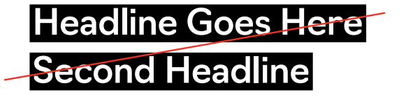
Blackout proportions have been changed. |
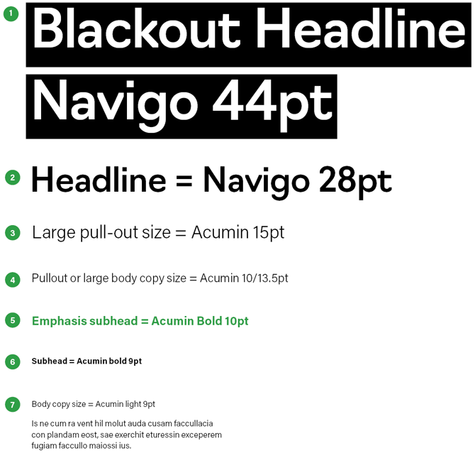
Typographic HierarchyThe below measurements provide a framework for setting type within the Built Environs style, and should be used as a guide when executing various layouts.
|
 |