Logo
Download the Built Environs Logo Suite
Logo
|
Our new logo is a contemporary evolution of our brand establishing a close visual link with McConnell Dowell. Our Logo is our brand’s signature and is a key visual representation of the brand. The logo combined with the strapline: Creative Construction, helps us stand out, creating a distinctive, recognisable and ultimately memorable Built Environs brand identity. Used effectively with all other components of the brand identity, the logo plays a vital role in the overall visual identity system. |
Our logo has been specifically crafted Only use the master artwork files, never separate, |
Colour logo downloads
Use the reversed logo, on our hero green background, wherever possible.
|
Reversed logo (primary):
|
Positive logo (secondary):
|
Logo downloads above are;
Office use:PNG format for internal document sand screen/online work.
Print use: PDF format for professional printing - banners, posters etc.
Full BE logo suite downloadable at top & bottom of this page.
Mono (1-colour) logos
Only used when Colour Logo cannot be used.
|
Reversed logo (primary):
|
Positive logo (secondary):
|
Co-brandingUse in layouts where we want the Built Environs logo linked together in a close relationship with the McConnell Dowell logo. |

Co-brand horizontal positive 
Co-brand horizontal reverse
|
Clear Space & Minimum SizeThe Built Environs logo must always be clearly identified on all material and protected by clearspace. Keep the logo free of other elements Measuring Clearspace Minimum size Minimum size in print Print=30 mm wide Minimum size on screen: 200 px wide |
X = width of the capital B 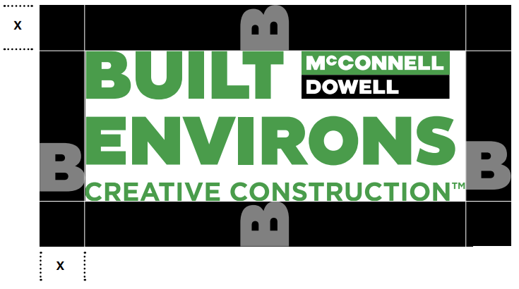 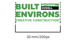
Minimum print size |
Incorrect UseThe Built Environs logo should only be used as described in these guidelines. The logo is supplied as digital master artwork files and should never be distorted, redrawn broken apart or altered in any way. |
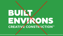
Never break apart the elements |
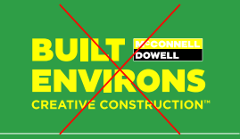
Never change the colour. |
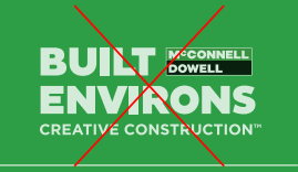
Never make transparent or tinted. |
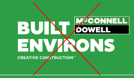
Never change the size or proportions of the elements. |
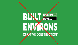
Never distort or skew. |
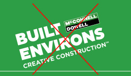
Never rotate or use on an angle. |
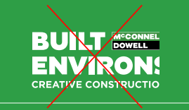
Never crop the logo. It must always be used in its entirety. |
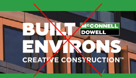
Never use over busy backgrounds. |
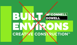
Always ensure there are no graphic elements or complex backgrounds inside the logo clearspace area. |
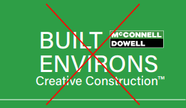
Never change or recreate any elements of the logo. |
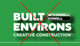
Never apply any effects or filters. |
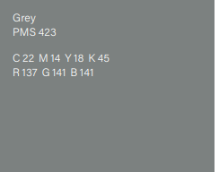
Home Without HarmHome Without Harm is the McConnell Dowell and Built Environs official safety sub-brand. It has been designed to be used in conjunction with the Built Environs logo wherever it appears and must not be displayed on its own. |
|
Joint Venture BrandingWhen negotiating joint venture branding, it is imperative that the Built Environs logo be incorporated. If we are the lead partner, the Built Environs logo should be first under all circumstances. Use the clear space rules to determine how our logo is sized and looks in the lockup. |

Joint Venture branding example – Horizontal 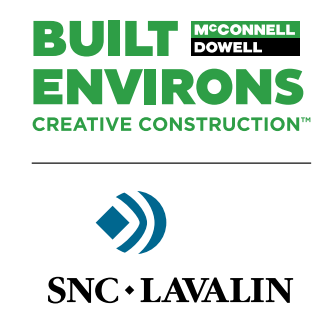
Joint Venture branding example – Vertical |
Embroidered LogoA version of our logo has been specifically created for embroidery. The proportions and structure are not to be altered in any way. Position Colours
Ask for samples from new suppliers |

Built Environs hero green match Pantone 7740 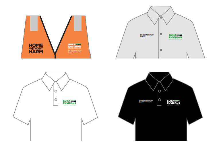 |
