Colour
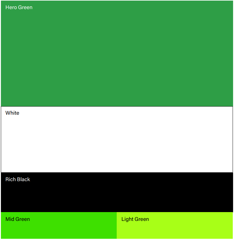
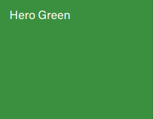
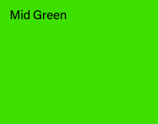
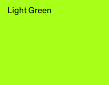
Colour PaletteGreen white and black, these are our brand colours that form a strong visual association with the McConnell Dowell brand. Consistent use of colour is vital in building a strong and easily recognisable Built Environs brand. Hero Green White Black Mid & Light Green |
 |
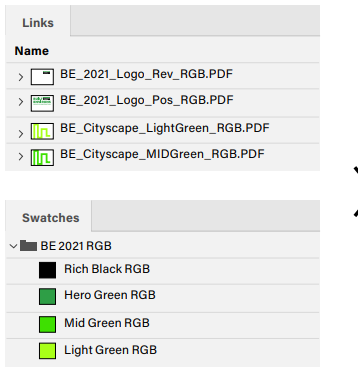
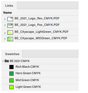
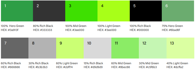
Colour ReproductionIt’s important that our brand colours are reproduced accurately. Colours change dramatically between screen and print. This is particularly noticeable in our mid and light greens. Always use the specified PMS, CMYK and RGB values for each colour. Each value has been specifically calibrated for that particular display environment. These values enable accurate reproduction of all colours in print and digital scenarios.
|
|


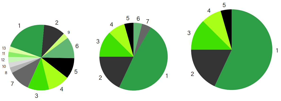
Colours for Information GraphicsTints from of our brand colours can be used for colouring information graphics. The examples here demonstrate:
|
 |
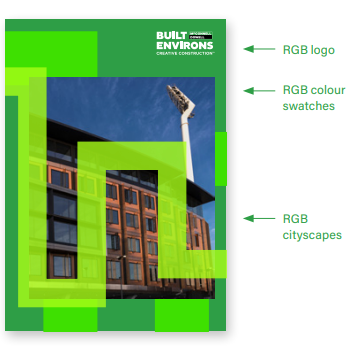
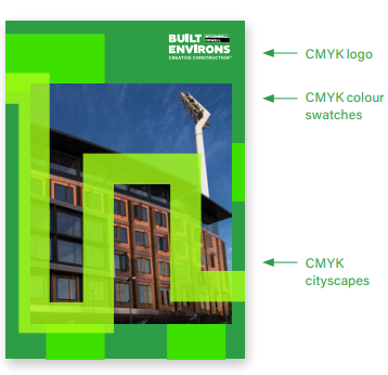
Adjust Colours for OutputColours change dramatically between screen and print outcomes. This is particularly noticeable in the mid to light greens of the Cityscape graphics. To ensure vibrant colours it’s important to always:
Tip: When working in CMYK mode for print DO NOT include colour profiles. This includes when making the final PDF. |
Change colours and assets for the intended output >
|