Cityscape
Download the Built Environs Cityscape Graphic Suite
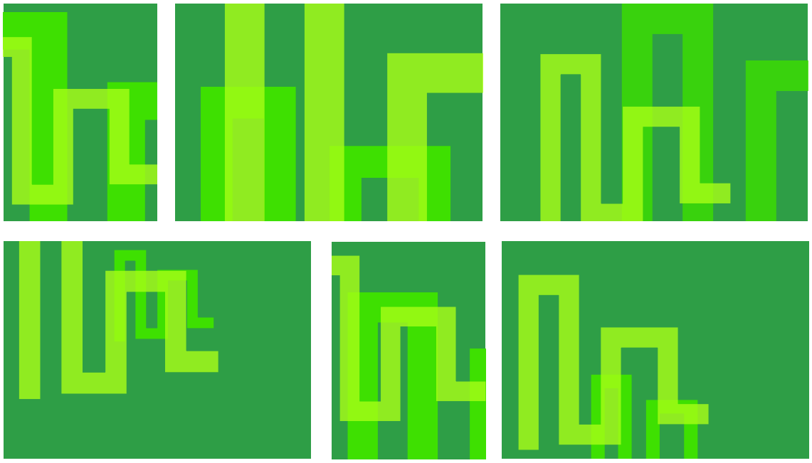
CityscapeThe cityscape graphic shows a simplified macro view of a city adding vibrancy and energy to our communications and is an integral part of the Built Environs brand look & feel. There are two different coloured master cityscape graphics which may be used at different zooms, configurations and crops depending on where it is being used.
The cityscape graphics have been specifically crafted. Only use the master artwork files, never modify or re-draw them. |
 |
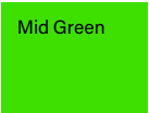
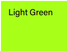
ColoursIt’s important that our brand colours are reproduced accurately. Colours change dramatically between screen and print. This is particularly noticeable in the mid and light green cityscapes. Always use the specified PMS, CMYK and RGB values for each colour. Each value has been specifically calibrated for that particular display environment. These values enable accurate reproduction of all colours in print and digital scenarios.
|
Use the correct coloured cityscape for the intended output
|
FlexibleWe’re flexible in how we size the cityscape depending on where it is being used. This means the cityscape can be sized appropriately to reflect the tone of the message and context of the application. Whether large and bleeding off the page, sitting over an image, cropped in tight or small on the edge of the page, the cityscape graphic can adapt to support the message. |
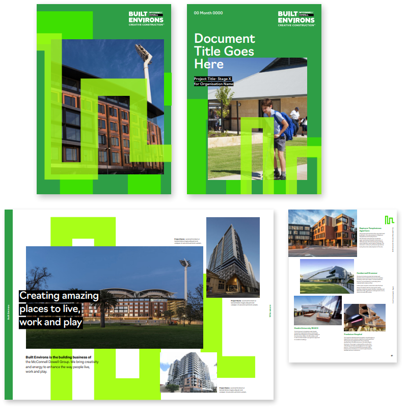 |
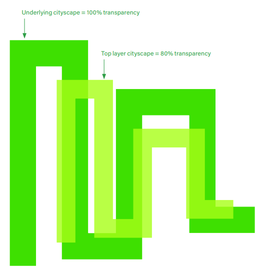
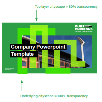
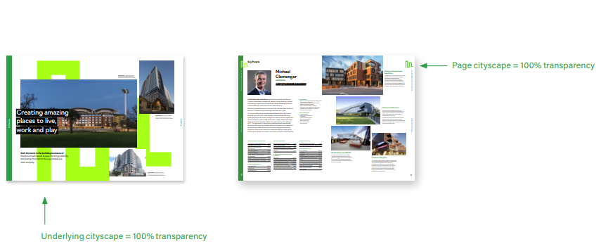
TransparencyWhen used together, the cityscape graphics are layered. The top layer cityscape is set with a transparency overlay of 80%. This also applies when sitting over images. When there is only one cityscape on the page or under images, the cityscape is set with a transparency overlay of 100%. |
 |
 |
 |
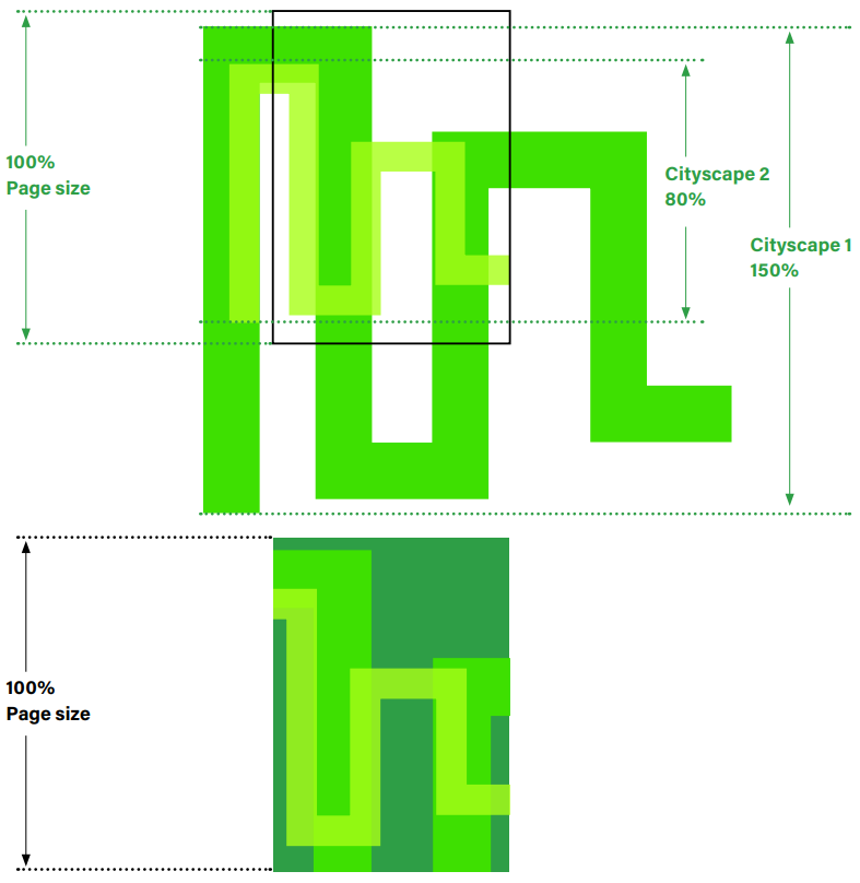
ArrangementThe cityscape graphics activate the page and interact with each other. When using the two cityscape graphics together they look best when there is a noticable difference in size. |
 |
Example Arrangements
Usage
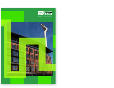
Do use the cityscape graphics on covers and section dividers. |
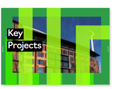
The cityscape can go over images when you don’t have to see the details. |
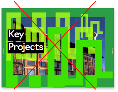
Don’t use more than the two cityscape graphics at once. |
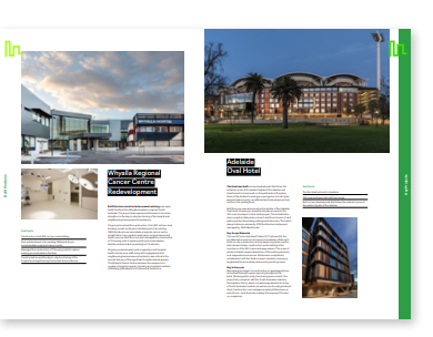
Do make the cityscape graphics smaller on pages with lots of detail. |
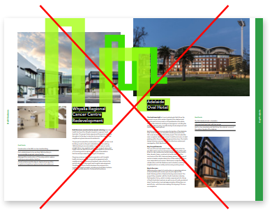
Don’t cover images with the cityscape graphic when you need to see the detail. For example when illustrating a specific project. |
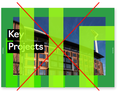
Don’t place the cityscape graphic over typography. It always sits behind type. |
